ProteinK

A new visual identity for a range of protein-based products from Ketterer German Bread.

Client Ketterer German Bread
Year 2024
Service Branding · Packaging · Visual direction

Building an identity around protein.

Ketterer German Bread wanted to refresh the imagery of ProteinK, its range of high-protein products, with an identity able to stand out within its catalogue and connect with more health-conscious consumers.

The project needed to clearly communicate the products' nutritional qualities without losing the warm, artisan character associated with the Ketterer brand.
ProteinK range packaging

A clear and recognisable identity.

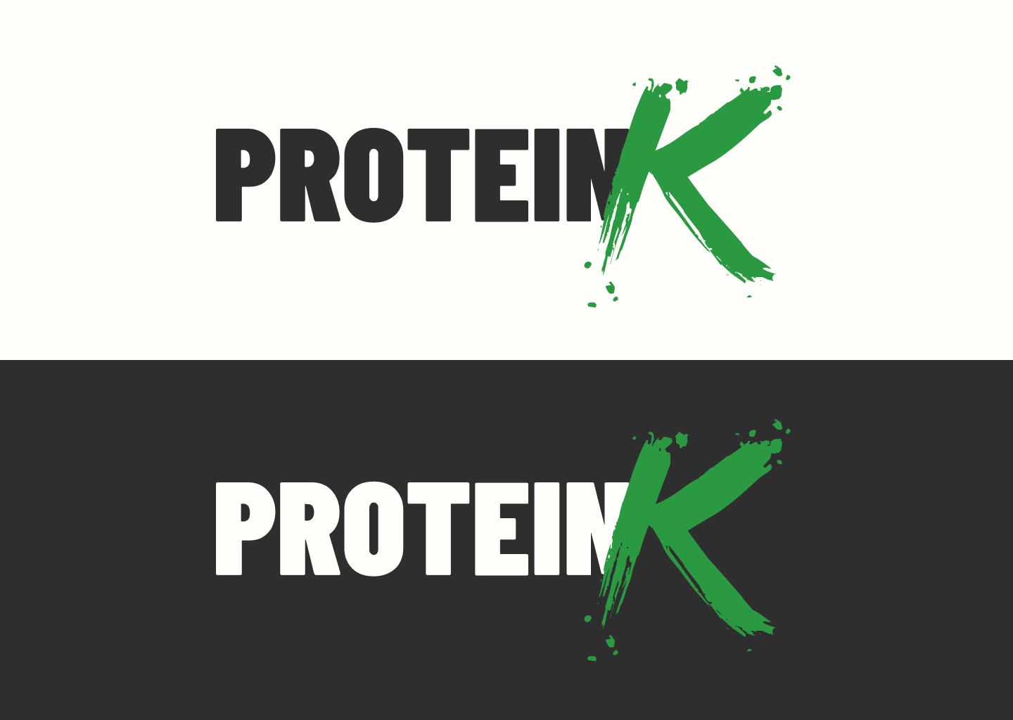
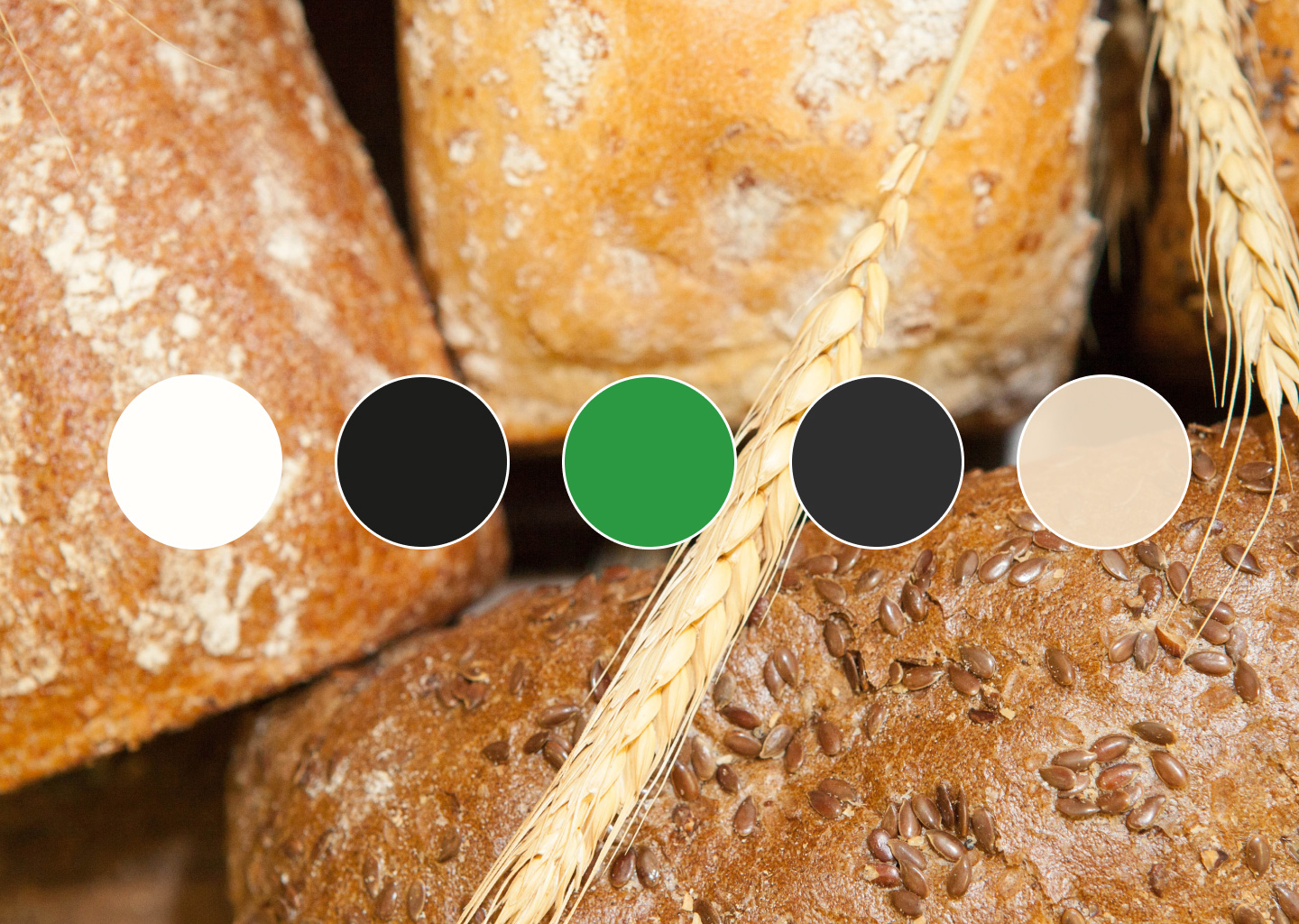
The visual proposal aims to build a language of its own for ProteinK, while staying directly connected to the Ketterer brand.

The graphic system makes it easy to spot the protein range and communicate each product's key features in a direct, contemporary, appealing way.

ProteinK product in scene

One visual system for the whole range.

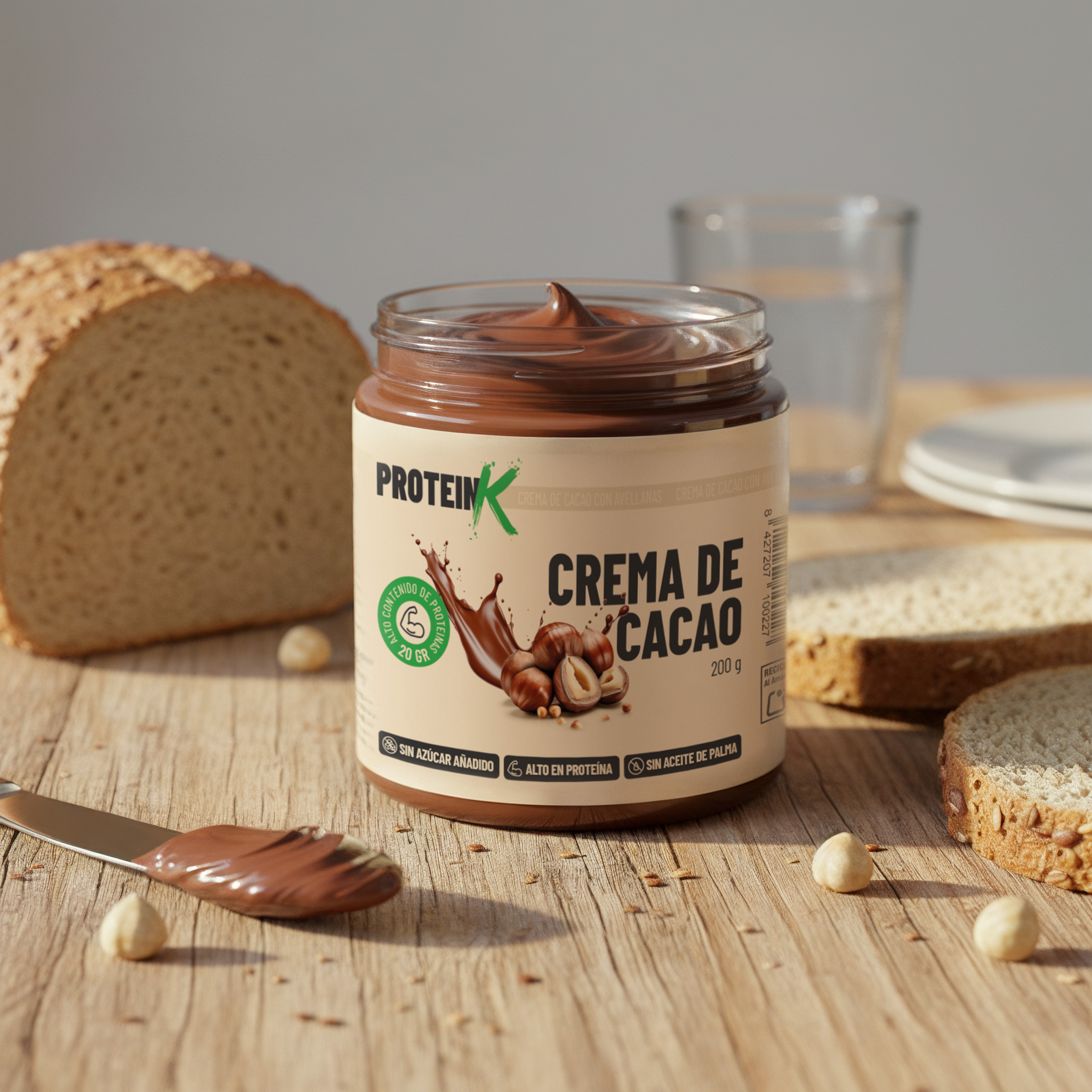
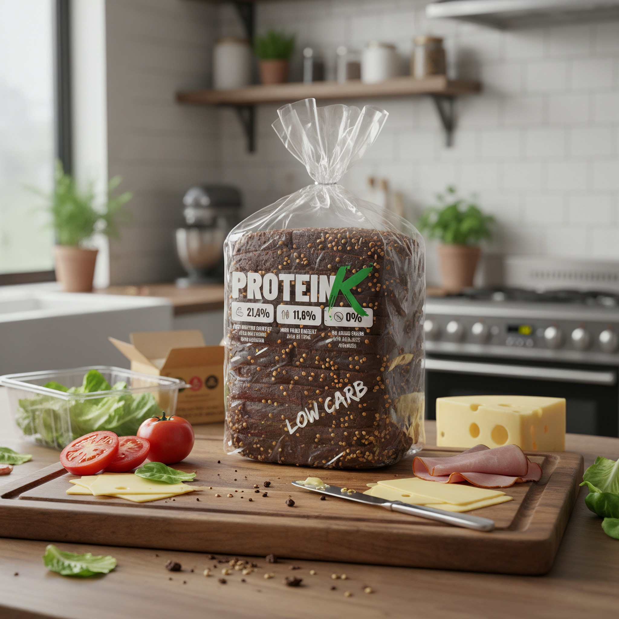
The identity is applied across different products in the range, including protein bread, hazelnut chocolate spread and protein muffin mix.

Each product keeps a shared graphic structure, building a recognisable, coherent family without losing the personality of each individual reference.

ProteinK chocolate spread
ProteinK range packaging and products

A product range with its own identity.

The result is a visual system that gives ProteinK its own identity and lets the full range be presented as a coherent family of products.

The new visual language combines nutritional information, visual appeal and brand recognition, positioning ProteinK as a contemporary proposal within Ketterer's catalogue.

Art direction Visual identity Packaging design Visual direction

Ketterer

↖︎

Graphic communication

↗︎