Ketterer

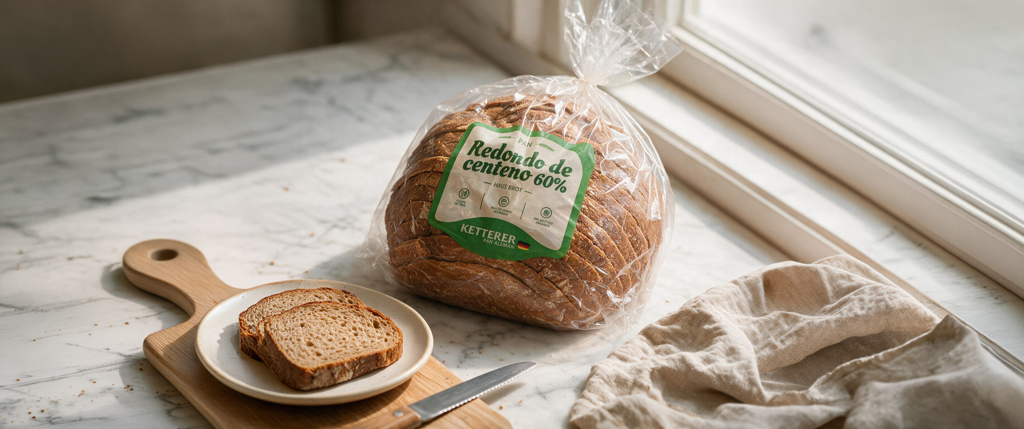
A packaging redesign to refresh Ketterer German Bread's identity without losing its artisan character.

Client Ketterer German Bread
Year 2022
Service Branding · Packaging · Label design
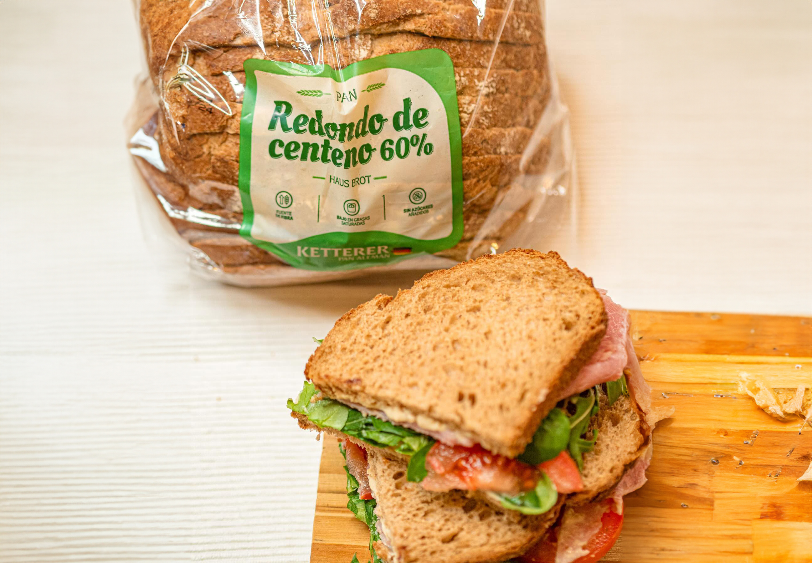
Ketterer German Bread packaging and labels

Refreshing the identity without losing its essence.

Ketterer German Bread needed to refresh its product imagery to achieve a more current, appealing presence at the point of sale.

The challenge was to evolve the existing identity while keeping the elements that were already part of the brand's recognition, all while reinforcing its values of quality, tradition and artisan craft.
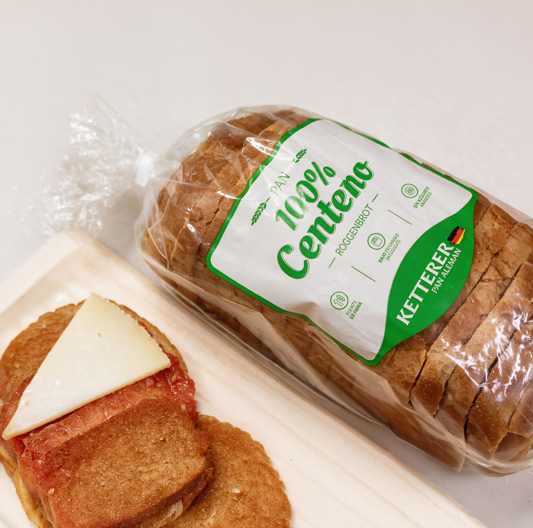
Label design proposal for Ketterer

A fresh take on the brand.

The redesign builds on Ketterer's already-recognisable visual codes to create labels that are clearer, more contemporary and more consistent across the different product references.

Colour, typography and information layout help highlight each bread's characteristics and communicate its ingredients and nutritional benefits directly.

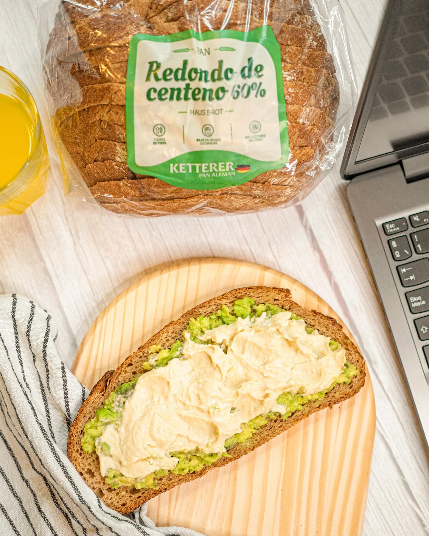
Detail of Ketterer's new labels

A more current packaging for a brand with tradition.

The result is a labelling system that modernises Ketterer's presence while keeping its link to German bread-making tradition and artisan craft.

The new proposal makes it easier to identify each product and creates a coherent visual family, able to connect with regular customers while bringing the brand closer to new ones.

Art direction Visual identity Packaging design Label design
Final packaging for Ketterer German Bread

Brand Identity

↖︎

ProteinK

↗︎